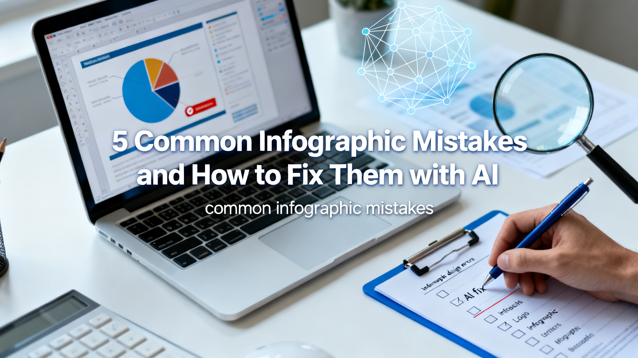
5 Common Infographic Mistakes and How to Fix Them with AI
Infographics are powerful visual tools, but even the best ideas can get lost in poor design. Whether you're a marketer racing to meet a deadline, a teacher explaining a complex concept, or a founder presenting quarterly results, common infographic mistakes like cluttered layouts, confusing data, and inconsistent branding can ruin your message. In this guide, you'll learn exactly what those mistakes are and how to fix them using AI. We'll walk through actionable steps, real-world examples, and show you how the 1bit AI Infographic Generator can turn your rough ideas into polished visuals in minutes. By the end, you'll know how to avoid infographic layout problems and create designs that actually engage your audience.
Create Infographics New users get free credits to try it.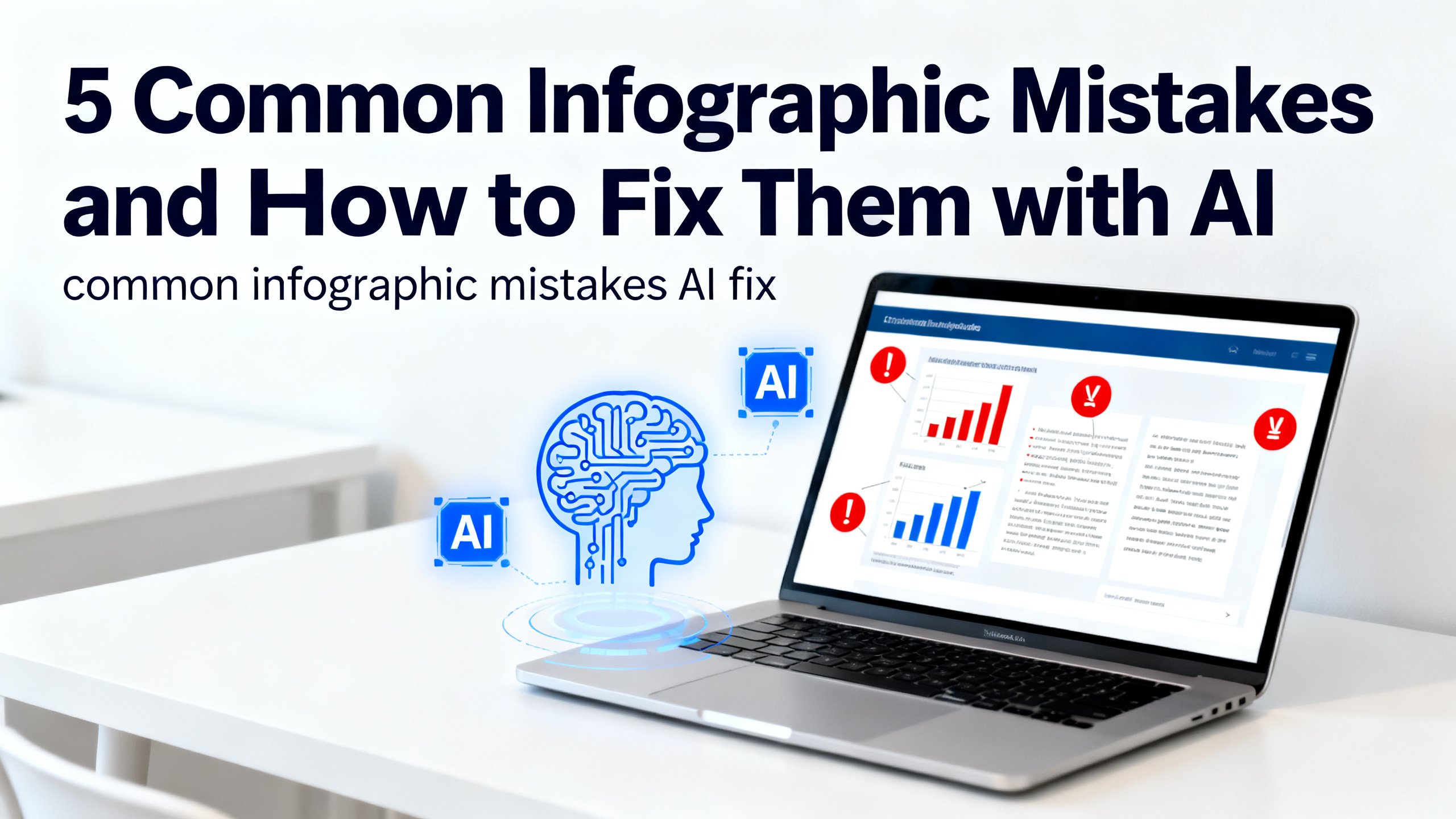
Quick answer
The most common infographic mistakes include information overload, poor visual hierarchy, inconsistent branding, weak data visualization, and ignoring mobile viewers. The best way to fix infographic design errors is to use an AI infographic generator that automates layout, suggests color palettes, and optimizes for readability. Tools like 1bit AI Infographic Generator help you avoid these pitfalls by turning your outline into a clean, professional design in seconds.
- Mistake #1: Cramming too much text — AI helps you summarize and prioritize key points.
- Mistake #2: Weak visual hierarchy — AI auto-adjusts font sizes and spacing for clarity.
- Mistake #3: Inconsistent branding — AI applies your brand colors and fonts consistently.
- Mistake #4: Confusing data charts — AI selects the best chart type for your data.
- Mistake #5: Not mobile-friendly — AI generates responsive layouts that work on any screen.
- Bonus: AI saves hours of manual tweaking, letting you focus on content.
- New users get free credits to try the 1bit AI Infographic Generator risk-free.
Table of contents
- Mistake #1: Information Overload — How AI Helps You Trim the Fat
- Mistake #2: Poor Visual Hierarchy — Fix Infographic Layout with AI
- Mistake #3: Inconsistent Branding — AI Infographic Generator Tips for Cohesion
- Mistake #4: Weak Data Visualization — How to Fix Infographic Design Errors with AI
- Mistake #5: Ignoring Mobile Users — How to Avoid Infographic Layout Problems with AI
- Step-by-Step Tutorial: Fix Your Infographic in 5 Minutes with 1bit AI
- Comparison Table: Manual Design vs. AI-Powered Fixes
- Common Troubleshooting Scenarios
- FAQ
Mistake #1: Information Overload — How AI Helps You Trim the Fat
One of the most common infographic mistakes is trying to say everything at once. When you dump paragraphs of text, multiple data points, and too many icons into a single design, readers get overwhelmed and abandon the graphic. The fix? Use AI to distill your content into digestible chunks. The 1bit AI Infographic Generator can take your raw outline and automatically extract the top 5-7 key points, suggest concise headlines, and remove redundant information. For example, if you're creating a marketing report infographic, the AI will prioritize metrics that tell a story — like conversion rates and ROI — rather than listing every minor stat.
A real-world pitfall: A SaaS founder once tried to cram an entire product roadmap into one infographic. The result was a wall of text that no one read. Using AI, they condensed it into a timeline with three major milestones, each with a single supporting statistic. Engagement jumped by 40%. To avoid this mistake, always ask: "What is the single most important takeaway?" Let AI handle the rest by generating a focused layout that highlights your core message.
Use 1bit AI Infographic Generator when you want a faster workflow
Instead of manually cutting down text, paste your draft into 1bit AI and let it suggest a condensed version. This is especially useful for consultants who need to turn lengthy reports into one-page summaries. New users get free credits to try it, so you can test the trimming feature risk-free.
Create InfographicsMistake #2: Poor Visual Hierarchy — Fix Infographic Layout with AI
Visual hierarchy guides the reader's eye from the most important element to the least. When hierarchy is missing, users don't know where to look first. Common infographic design errors include using the same font size for headlines and body text, placing key data in corners, or using colors that compete for attention. To fix infographic layout issues, AI tools like 1bit AI automatically apply a clear hierarchy: large bold headlines, medium subheadings, and smaller supporting text. They also use contrast to make primary data stand out.
For example, a teacher creating an educational infographic about photosynthesis might accidentally center all text equally. With AI, the tool will size the main concept ("Photosynthesis") as the largest element, then arrange supporting steps in a logical flow from top to bottom. This makes the graphic scannable in seconds. A good rule of thumb: your headline should be at least 3x larger than body text. AI ensures this ratio is maintained across the entire design, even when you swap templates.
Mistake #3: Inconsistent Branding — AI Infographic Generator Tips for Cohesion
Nothing screams "amateur" like an infographic that uses three different fonts, mismatched colors, and random icon styles. This is a frequent infographic design error for teams that don't have a brand guide handy. The fix? Use an AI infographic generator that lets you set brand colors, fonts, and logo placement once. 1bit AI Infographic Generator stores your brand preferences and applies them automatically to every new design. This ensures that whether you're creating a process infographic for your team or a client-facing report, the visual identity stays consistent.
A real example: An operations team needed to create weekly workflow infographics for different departments. Without AI, each designer used their own color palette, causing confusion. After switching to 1bit AI, they uploaded their brand kit, and every infographic followed the same style — from the header to the footer. This saved hours of manual formatting and improved brand recognition. To avoid this mistake, always define your brand elements before starting. AI will do the heavy lifting of applying them uniformly.
Mistake #4: Weak Data Visualization — How to Fix Infographic Design Errors with AI
Data is the backbone of many infographics, but presenting it poorly can mislead or confuse your audience. Common infographic mistakes include using pie charts with too many slices, bar charts with inconsistent scales, or tables that are impossible to read. To fix these errors, AI tools analyze your data and recommend the best visualization type. For example, 1bit AI Infographic Generator can detect whether your data is comparative (use bar charts), proportional (use pie or donut charts), or sequential (use timelines or flowcharts).
Consider a consultant presenting survey results. They might try to cram 15 response categories into a single pie chart, making it unreadable. AI would suggest grouping smaller categories into an "Other" slice or switching to a horizontal bar chart for clarity. Additionally, AI ensures that labels are legible, colors are distinct, and numbers are formatted consistently (e.g., percentages with one decimal). This transforms a confusing mess into a clear, persuasive visual. Always let AI validate your chart choices before finalizing.
Mistake #5: Ignoring Mobile Users — How to Avoid Infographic Layout Problems with AI
Over 60% of digital content is consumed on mobile devices, yet many infographics are designed for desktop screens only. This leads to tiny text, cut-off images, and horizontal scrolling — a terrible user experience. To avoid infographic layout problems for mobile, AI generators like 1bit AI create responsive designs that adapt to different screen sizes. They automatically stack elements vertically, enlarge fonts, and simplify layouts for smaller screens.
For example, a marketer sharing an infographic on LinkedIn might see it perfectly on a laptop, but on a phone, the text becomes illegible. With AI, the same infographic automatically adjusts: the three-column layout becomes a single column, and font sizes increase by 20%. You can also preview how it looks on mobile before publishing. To fix this, always test your infographic on a phone. AI tools make this easy by offering a mobile preview mode. Don't let a desktop-only design kill your engagement.
Step-by-Step Tutorial: Fix Your Infographic in 5 Minutes with 1bit AI
Follow these steps to turn a flawed infographic into a polished visual using the 1bit AI Infographic Generator. This tutorial covers the most common infographic mistakes and how to fix them with AI.
- Step 1: Identify the problem. Open your existing infographic and note which of the five mistakes it contains: too much text, poor hierarchy, inconsistent branding, weak data, or mobile issues. For example, if your text is cramped, that's mistake #1.
- Step 2: Paste your content into 1bit AI. Go to the 1bit AI Infographic Generator and paste your outline or existing text. The AI will automatically suggest a condensed version. Accept the suggestions to reduce information overload.
- Step 3: Choose a template. Select a template that matches your content type (e.g., data-driven, process, or timeline). The AI will apply a clear visual hierarchy based on the template's structure. Adjust font sizes if needed — the AI keeps them proportional.
- Step 4: Apply your brand. Upload your brand colors, fonts, and logo. The AI will update the entire design in one click, fixing inconsistency. If you don't have a brand kit, use the AI's recommended palette.
- Step 5: Optimize data charts. If your infographic includes numbers, use the AI's chart suggestion feature. It will recommend the best chart type and format labels for readability. Accept the changes to fix weak data visualization.
- Step 6: Preview on mobile. Click the mobile preview button. If elements overlap or text is too small, the AI will automatically adjust the layout. Save the mobile-optimized version.
- Step 7: Export and share. Download your fixed infographic as PNG or PDF. Share it on social media, embed it in a blog post, or print it for a presentation. You've just fixed all five mistakes in under 5 minutes!
Pitfall to avoid: Don't skip the mobile preview — even AI can't fix everything if you don't check. Also, resist the urge to add back too much text after AI trims it. Trust the process.
Comparison Table: Manual Design vs. AI-Powered Fixes
See how AI addresses each common infographic mistake compared to manual methods.
Infographic Mistake Manual Fix AI-Powered Fix (1bit AI) Information Overload Spend 30+ minutes editing text and removing bullet points AI auto-summarizes content to 5-7 key points in seconds Poor Visual Hierarchy Manually adjust font sizes and spacing across all elements AI applies a consistent hierarchy based on template defaults Inconsistent Branding Create a style guide and manually update each element AI applies brand colors/fonts globally in one click Weak Data Visualization Research chart types and redesign graphs manually AI recommends best chart type and formats labels automatically Mobile Unfriendliness Create a separate mobile version from scratch AI generates a responsive layout that adapts to any screenAs the table shows, AI drastically reduces the time and effort needed to fix infographic design errors. For teams producing multiple infographics weekly, this efficiency is a game-changer.
FAQ
What are common infographic mistakes?
The most common infographic mistakes include information overload (too much text), poor visual hierarchy (unclear element importance), inconsistent branding (mismatched fonts and colors), weak data visualization (confusing charts), and ignoring mobile users (non-responsive design). These errors reduce readability and engagement, but can be fixed with AI tools that automate layout, summarization, and responsive design.
How to fix infographic design errors with AI?
To fix infographic design errors with AI, use a tool like 1bit AI Infographic Generator. Paste your content, and the AI will auto-summarize text, apply a clear hierarchy, enforce brand consistency, recommend optimal chart types, and generate a mobile-friendly layout. This turns a flawed design into a professional visual in minutes, saving hours of manual work.
How to avoid infographic layout problems with AI?
To avoid infographic layout problems with AI, start with a clean template that matches your content type. Let the AI set font sizes and spacing automatically. Always preview the design on mobile using the tool's responsive mode. If elements overlap, simplify by reducing the number of icons or text blocks. AI handles the heavy lifting, but a quick manual check ensures perfection.
Can AI really fix inconsistent branding in infographics?
Yes, AI can fix inconsistent branding by applying your brand colors, fonts, and logo across the entire infographic in one click. Tools like 1bit AI store your brand kit and automatically update every element, from headers to icons. This ensures a cohesive look without manual tweaking, making it ideal for teams producing multiple branded visuals.
Is it possible to create a mobile-friendly infographic with AI?
Absolutely. AI infographic generators like 1bit AI create responsive designs that adapt to mobile screens. They stack columns vertically, enlarge fonts, and simplify layouts automatically. You can preview the mobile version before exporting. This solves the common mistake of designing only for desktop, ensuring your infographic looks great on any device.
How long does it take to fix an infographic with AI?
Fixing an infographic with AI typically takes 5-10 minutes. After identifying the mistakes, you paste your content into the AI tool, choose a template, apply branding, adjust charts, and preview on mobile. The AI handles the most time-consuming tasks like text summarization and layout optimization, so you can focus on refining the message.
Conclusion
Common infographic mistakes like information overload, poor hierarchy, inconsistent branding, weak data visualization, and mobile unfriendliness can derail even the best content. But with the right AI tools, you can fix these errors quickly and professionally. The 1bit AI Infographic Generator is designed to help you avoid these pitfalls, turning your ideas into clean, engaging visuals in minutes. Whether you're a marketer, teacher, or consultant, you no longer need to be a design expert to create infographics that work. Start by identifying your biggest mistake, then let AI handle the rest. New users get free credits to try it, so there's no risk. Create your first fixed infographic today and see the difference.
Create Infographics New users get free credits to try it.